Seeing White* on a Map
This notebook demonstrates some of the data wrangling and mapping capabilities of the censusdis package. It does the following:
Load metadata on the US Census redistricting data set from 2020
Load data on total population and the population of various ractial groups for every county in the United States
Determine the fraction of the population that is white
Plot the results on a map
*With apologies to the Seeing White podcast for borrowing the name.
Basic imports
[1]:
import censusdis.data as ced
import censusdis.maps as cdm
from censusdis.states import ALL_STATES_AND_DC
Setup
For more details on what we are setting up here, see the comments in this introductory notebook.
[2]:
CENSUS_API_KEY = None
[3]:
YEAR = 2020
DATASET = "dec/pl"
GROUP = "P2"
Fetch metadata
We will fetch the metadata on what fields are available and then select the ones that represent the population count of people who identify as white, possibly mixed with one or more other races and those who identify as white alone.
[4]:
leaves = ced.variables.group_leaves(DATASET, YEAR, GROUP)

df_all_variables = ced.variables.all_variables(DATASET, YEAR, GROUP)

df_all_variables
[4]:
| YEAR | DATASET | GROUP | VARIABLE | LABEL | SUGGESTED_WEIGHT | VALUES | |
|---|---|---|---|---|---|---|---|
| 0 | 2020 | dec/pl | P2 | P2_001N | !!Total: | NaN | None |
| 1 | 2020 | dec/pl | P2 | P2_002N | !!Total:!!Hispanic or Latino | NaN | None |
| 2 | 2020 | dec/pl | P2 | P2_003N | !!Total:!!Not Hispanic or Latino: | NaN | None |
| 3 | 2020 | dec/pl | P2 | P2_004N | !!Total:!!Not Hispanic or Latino:!!Population... | NaN | None |
| 4 | 2020 | dec/pl | P2 | P2_005N | !!Total:!!Not Hispanic or Latino:!!Population... | NaN | None |
| ... | ... | ... | ... | ... | ... | ... | ... |
| 68 | 2020 | dec/pl | P2 | P2_069N | !!Total:!!Not Hispanic or Latino:!!Population... | NaN | None |
| 69 | 2020 | dec/pl | P2 | P2_070N | !!Total:!!Not Hispanic or Latino:!!Population... | NaN | None |
| 70 | 2020 | dec/pl | P2 | P2_071N | !!Total:!!Not Hispanic or Latino:!!Population... | NaN | None |
| 71 | 2020 | dec/pl | P2 | P2_072N | !!Total:!!Not Hispanic or Latino:!!Population... | NaN | None |
| 72 | 2020 | dec/pl | P2 | P2_073N | !!Total:!!Not Hispanic or Latino:!!Population... | NaN | None |
73 rows × 7 columns
[5]:
df_total_variables = df_all_variables[
    df_all_variables["LABEL"].str.endswith("!!Total:")
]
df_white_alone_variables = df_all_variables[
    df_all_variables["LABEL"].str.endswith("White alone")
]

total_variables = list(df_total_variables["VARIABLE"])
white_alone_variables = list(df_white_alone_variables["VARIABLE"])
Load data
Now that we know what fields we are interested in we can load data for those fields at the county level for all 50 states and DC. Since we are going to want to plot it, we add with_geometry=True so that we get back a gpd.GeoDataFrame with the geometry of every county instead of a plain pd.DataFrame.
[6]:
gdf_counties = ced.download(
    DATASET,
    YEAR,
    total_variables + white_alone_variables,
    state=ALL_STATES_AND_DC,
    county="*",
    api_key=CENSUS_API_KEY,
    with_geometry=True,
)
[7]:
gdf_counties.head()
[7]:
| STATE | COUNTY | P2_001N | P2_005N | geometry | |
|---|---|---|---|---|---|
| 0 | 01 | 001 | 58805 | 41582 | POLYGON ((-86.92120 32.65754, -86.92035 32.658... |
| 1 | 01 | 003 | 231767 | 186495 | POLYGON ((-88.02858 30.22676, -88.02399 30.230... |
| 2 | 01 | 005 | 25223 | 11086 | POLYGON ((-85.74803 31.61918, -85.74544 31.618... |
| 3 | 01 | 007 | 22293 | 16442 | POLYGON ((-87.42194 33.00338, -87.33177 33.005... |
| 4 | 01 | 009 | 59134 | 49764 | POLYGON ((-86.96336 33.85822, -86.95967 33.857... |
Summarize the white population
The next step is to total up the people who identify as white, possibly with other races, and those who identify as white alone.
[8]:
gdf_counties["white_alone"] = gdf_counties[white_alone_variables].sum(axis=1)
[9]:
gdf_counties["pct_white_alone"] = 100.0 * (
    gdf_counties["white_alone"] / gdf_counties[total_variables[0]]
)
[10]:
gdf_counties[total_variables + ["white_alone", "pct_white_alone"]].head()
[10]:
| P2_001N | white_alone | pct_white_alone | |
|---|---|---|---|
| 0 | 58805 | 41582 | 70.711674 |
| 1 | 231767 | 186495 | 80.466589 |
| 2 | 25223 | 11086 | 43.951949 |
| 3 | 22293 | 16442 | 73.754093 |
| 4 | 59134 | 49764 | 84.154632 |
[11]:
gdf_counties[["pct_white_alone"]].describe()
[11]:
| pct_white_alone | |
|---|---|
| count | 3143.000000 |
| mean | 74.150915 |
| std | 19.804085 |
| min | 1.776396 |
| 25% | 62.575904 |
| 50% | 80.725998 |
| 75% | 90.337848 |
| max | 97.404829 |
Load state shapefile
When we plot the data on a map, we also want to plot the boundaries of the states. The API we will use will download the shapefiles from the US Census and cache them in a local filesystem.
If you want to browse available files you can look at the US Census cartographic boundary page.
The specific zip file the code will download for us is the 2020 500,000:1 scale state boundary file `cb_2020_us_state_500k.zip <https://www2.census.gov/geo/tiger/GENZ2020/shp/cb_2020_us_state_500k.zip>`__.
[12]:
reader = cdm.ShapeReader(year=YEAR)
[13]:
gdf_state_bounds = reader.read_cb_shapefile("us", "state")
gdf_state_bounds = gdf_state_bounds[gdf_state_bounds["STATEFP"].isin(ALL_STATES_AND_DC)]
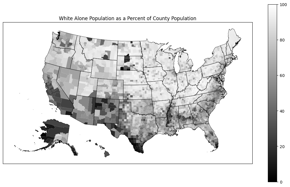
Plot on a map
This is a basic plot, that you can style as you wish. Note that we use cdm.plot_us and cdm.plot_us_boundary because they take care of moving Alaska and Hawaii to a location where they are easy to visualize. If we did not do this, they would appear in their actual geographic locations relatively far from the continental US and the Aleutian islands would be split at ±180° longitude.
[14]:
import matplotlib.pyplot as plt

plt.rcParams["figure.figsize"] = (14, 8)

col, name = "pct_white_alone", "White Alone"

ax = cdm.plot_us(
    gdf_counties,
    col,
    cmap="gray",
    legend=True,
    vmin=0.0,
    vmax=100.0,
)

ax = cdm.plot_us_boundary(gdf_state_bounds, edgecolor="black", linewidth=0.5, ax=ax)

ax.set_title(f"{name} Population as a Percent of County Population")

ax.tick_params(
    left=False,
    right=False,
    bottom=False,
    labelleft=False,
    labelbottom=False,
)
[ ]: